Brand system
The GrowthQB logo
One mark, one wordmark, one accent. The helmet badge carries the brand at icon sizes; the wordmark stresses QB in GrowthQB green. Every asset below is built from the same geometry, so the logo holds together from a 16px favicon to a billboard.
01
Primary logo
On dark
Default across the product
On light
Marketing, documents, decks
Horizontal lockup. Badge, then a gap of 25% of the badge height, then the wordmark, optically centred on cap height.
02
Secondary logo
Stacked — on dark
Narrow layouts, covers, merch
Stacked — on light
Reports, print, signage
03
Monochrome
One-color black
Fax, engraving, single-ink print
One-color white
Photography, dark merch, video
In monochrome the accent is dropped entirely — never tint QB grey to fake it.
04
App icon, favicon & avatar
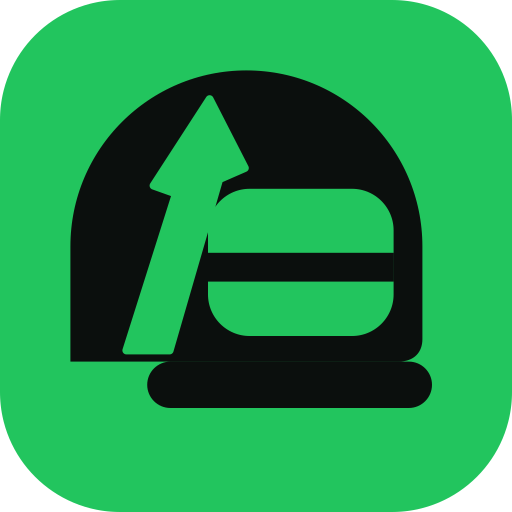
App icon
1024×1024, iOS & Android
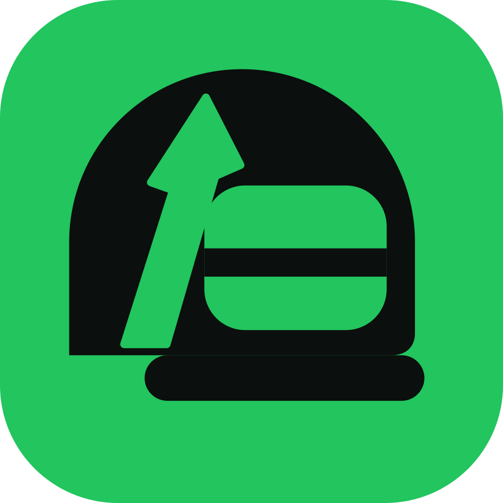
Social avatar
1000×1000, full-bleed
Website header
Horizontal lockup, 32px badge

Favicon
Shown at 16 / 24 / 32px
05
Clear space & minimum sizes
Clear space equals half the badge height (0.5×) on all four sides. Nothing — type, imagery, buttons or a page edge — enters that zone.
- Icon / favicon
- Badge only, never the wordmark
- Horizontal lockup
- Digital and print
- Stacked lockup
- Digital and print
- Large format
- Use the SVG or PDF, never a PNG
Scale test
16px24px32px48px64px96px128px06
Color
GrowthQB Green
#22C55E
Accent, badge field, QB
Field Green
#16A34A
QB on light backgrounds
Ink
#0B0F0D
Helmet, wordmark on light
Paper
#FFFFFF
Wordmark on dark
07
Misuse
- Don't re-color the badge or the helmet.
- Don't add gradients, bevels, glows or drop shadows.
- Don't stretch, skew, rotate or outline the lockup.
- Don't re-type the wordmark in another typeface or weight.
- Don't place the full-color badge on a busy photo — use monochrome.
- Don't shrink the wordmark below the minimum sizes; use the badge alone.
08